Mobile SEO
in
Aberdeen.
Mobile SEO in Aberdeen isn't optional. Over 70% of local searches happen on a phone, and Google ranks your site based on what its mobile crawler sees — not the lovely desktop version.
It's a core part of our Local SEO Package: mobile-first audits, sub-two-second loads on 4G, tap targets sized for thumbs, and Core Web Vitals tuned for the device 70% of your customers actually use. Mobile-responsive isn't the same as mobile-optimised.
Part of the Local SEO Package · 6-month minimum · Then rolling monthly

"Mobile-responsive" was a desktop trick from 2015.
Most agencies tick the "mobile-responsive" box and move on. Google's mobile crawler doesn't. It judges your site by what loads on a phone in real-world conditions — and it isn't impressed.
The site Google's mobile bot can't be bothered with.
- "Responsive" theme — just a desktop site squished smaller.
- 4-second loads on 4G — half your traffic gone before paint.
- Tap targets the size of a pixel, navigation hidden in 3 menus.
- Content hidden behind accordions Google never expands.
- Horizontal scrolling because the viewport meta tag is missing.
Built for the device 70% of customers use.
- Mobile-first design — desktop is the adaptation, not the source.
- Sub-2-second 4G loads — measured from real Aberdeen networks.
- 48px+ tap targets, sticky call button, thumb-zone primary CTAs.
- All content visible to Google — no rendering tricks, no hidden text.
- Mobile Core Web Vitals all green, monitored from real-user data.
The version Google ranks is the mobile one.
Since 2021, Google ranks every site based on what its mobile crawler sees — not the desktop version. If something's hidden on mobile (accordion, tab, "click to load more"), it might as well not exist. We audit the gap between what your desktop visitors see and what Google's bot reads on mobile, and close it.
- Mobile-desktop content parity check — every word, every image
- Hidden mobile content surfaced — no accordions Google can't read
- Mobile-only schema markup validated against the rendered DOM
-
Pages indexed from mobile crawl247 / 247
-
100%Content match · mobile vs desktop
-
0 elementsHidden mobile content
-
MatchStructured data parity
-
All visibleInternal links · mobile rendered
Fast on a phone. On 4G. In the rain.
PageSpeed scores in a lab don't predict how a site loads in the real world. We measure with Chrome User Experience Report data — actual visitors on actual phones on actual mobile networks — and tune until the 75th percentile load time stays under two seconds. That's the version Google ranks against.
- Tracked via Chrome UX Report — real users, not lab tests
- Image pipeline tuned for AVIF / WebP + responsive sizes
- Critical CSS inlined, JavaScript deferred below the fold
UX a thumb can actually use.
Google's mobile-friendly test checks twelve things — tap target size, readable text, viewport configured, no horizontal scrolling. We pass all of them. Then we go further: sticky tap-to-call, primary CTAs in the bottom thumb zone, and copy that's actually scannable on a 5-inch screen.
- Tap targets minimum 48×48px, primary CTA in thumb zone
- Font sizes 16px+ baseline, generous line height
- Sticky click-to-call bar on every page, on-tap visible
-
Viewport meta tag configured
-
All tap targets ≥ 48×48px
-
Font sizes readable (≥ 16px)
-
Content fits viewport (no scroll)
-
Touch interaction debounced
-
Sticky call-to-action on mobile
-
Phone & map links auto-open native
"Daniel was a pleasure to work with, extremely helpful, kind and really professional. I loved the outcome of my website, it's exactly what I've asked for and definitely helped my business to get far more recognition online."
Us, vs the other ways to handle mobile.
Mobile SEO is the easiest service to fake and the hardest to actually do. Here's the difference between ticking a checkbox and building for the device that drives 70% of your traffic.
From "responsive" to genuinely mobile-first.
Four phases of actual work. Foundation in the first month; ongoing monitoring after. Sites typically pass Google's mobile-friendly test by week three.
Mobile audit
Googlebot mobile render compared against desktop. Mobile UX checks. Field-data baseline. Findings ranked by ranking impact.
Speed fixes
Image pipeline rebuilt, JavaScript deferred, critical CSS inlined, fonts subset, CDN configured. Sub-2s 4G loads.
UX retrofit
Tap targets resized, sticky call bar added, hidden mobile content surfaced, viewport configured. Mobile-friendly test passes.
Monitor + maintain
Chrome UX Report data tracked weekly. Mobile speed regressions caught within 24h. Mobile traffic share and conversion monitored in Search Console.
Aberdeen businesses I've helped get found.
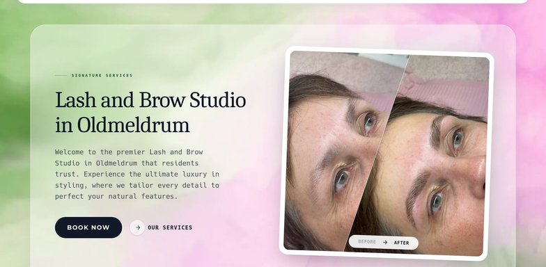
Eyeconic Beauty
Now ranking #1 across 24+ local search terms, with a 174% lift in Google impressions. Oldmeldrum.

Harthill Hospitality
An elegant, easy-to-browse catalogue built around clear, low-friction quote requests. Oyne, Aberdeenshire.

Inverurie West Parish Church
A warm, accessible website that makes service times, events and online giving easy to find. Inverurie.
Got a question? Likely answered.
What Aberdeen business owners ask before committing to mobile SEO. If yours isn't here, just ring.
Can I get just Mobile SEO without the rest of the package?
What's mobile-first indexing?
Do I need a separate mobile site?
What about AMP?
How long until mobile rankings improve?
Will the desktop site still look good?
Do you cover my area?
Local SEO across the North-East.
Based in the Granite City, ranking businesses right across Aberdeenshire — wherever your customers are searching.
Let's get you ranking on mobile first.
Drop me a line and we'll have a 20-minute chat about how your site renders on mobile, what's costing you ranking, and what I'd change first. Part of the Local SEO Package.
Don't have a website yet? Get a free one built mobile-first from day one →